PROBLEM
The following data related to the life in hrs of fifteen samples of six electric bulbs each drawn at intervals of 1 hour from a production process. Draw the Mean-Chart and Range-chart.
| S.no | Life time | |||||
| 1 | 620 | 687 | 666 | 769 | 839 | 686 |
| 2 | 501 | 585 | 524 | 585 | 655 | 668 |
| 3 | 673 | 701 | 636 | 567 | 622 | 660 |
| 4 | 646 | 626 | 572 | 628 | 632 | 743 |
| 5 | 494 | 984 | 659 | 643 | 660 | 640 |
| 6 | 634 | 755 | 625 | 582 | 685 | 555 |
| 7 | 619 | 710 | 664 | 693 | 773 | 534 |
| 8 | 631 | 723 | 614 | 535 | 551 | 570 |
| 9 | 482 | 791 | 533 | 612 | 497 | 499 |
| 10 | 706 | 524 | 626 | 503 | 662 | 754 |
| 11 | 530 | 432 | 379 | 690 | 724 | 536 |
| 12 | 485 | 497 | 608 | 393 | 648 | 729 |
| 13 | 585 | 535 | 762 | 588 | 625 | 737 |
| 14 | 462 | 490 | 635 | 587 | 554 | 673 |
| 15 | 722 | 608 | 665 | 587 | 531 | 705 |
Theory-
Control limits-
For any continuous process having variable T. 3-Sigma Control limits are given as-

And Central Line = µT
Control Chart for Mean-
When Standard Given-
Let given standard given value for mean and standard deviation be-
Then Upper Control Limit (UCL), Lower Control Limit (LCL) and Central Line are given by-
Where A is function of n(sample size) and can be obtained from mean chart table.
When Standard Not Given-
In This case we first estimate population mean, population varience and population range as-
Where m is number of samples, is sample mean, s is sample variance, R sample Range.
And as we already know-
E(s) = c2.σ
E(R) = d2.σ
Where c2 and d2 are function of n (sample size)
Therefore the control limits values are –
Where A1 is a function of n (sample size) and can be obtained from mean chart table.
And The control limits values are-
Where A2 is a function of n (sample size ) and can be obtained from mean chart.
Since, We have to plot the mean and range chart, lets look at the Control limits of Range-
Control Chart for Range-
We know that-
E(R) = d2.σ , and
σR = D.σ, where d2 and D are functions of n(sample size).
When standard σ is given as σ’-
Then control limits for Range is given as-
Lower control limit, LCL = d2.σ’ – 3.D.σ’ = D1.σ’
Upper control limit, UCL = d2.σ’ – 3.D.σ’ = D2.σ’
Central Line = d2.σ’
Where D1 and D2 are functions of n(sample size) and can be obtained from Range chart.
When standards are not given-
Hence the modified control limits are obtained as-
Where D3, D4 are functions of n (sample size ) and can be obtained from Range chart table.
R Code For Mean Chart and Range Chart-
#Command To Remove Previous Objects
rm(list=ls())

#Loading Some Library
library(readxl)
library(readr)

#Loading The Given Data set And checking The Characteristics
BulbData=read_excel("class work 09.xlsx")
View(BulbData)
mode(BulbData)


#Creating Somr Variable
No_of_Samp=length(BulbData[[1]])
SampList=list()
SampVec=c()
SampMean=c()
SampRange=c()

#Extracting Different Samples, their Means and Range
for (i in 1:No_of_Samp) {
  for (j in 2:7) {
    SampVec[j-1]=BulbData[[j]][i]
  }
  SampList[[i]]=SampVec[]
  SampMean[i]=mean(SampList[[i]])
  SampRange[i]={max(SampList[[i]])-min(SampList[[i]])}
}

#Obtaining Table Of Calculated Sample Means And Ranges
Sample_No=c(1:No_of_Samp)
calculatedData=data.frame()
calculatedData=data.frame(Sample_No,SampMean,SampRange)
calculatedData

#Estimating The Mean And The Range Of Population
mean_of_means=mean(SampMean)
mean_of_Ranges=mean(SampRange)

#Calculating UCL, LCL And Central Line Of Process Control For Mean
A2=0.483 #for n=6, A2=0.483 from Mean Chart, Appendix B(Goon,Gupta,DasGupta, Fundamental Of Statistics Vol-2)
lcl=mean_of_means-(A2*mean_of_Ranges)   #Formula For LCL
if(lcl<0){lcl=0}
LCL=lcl
UCL=mean_of_means+(A2*mean_of_Ranges)   #Formula For UCL
CENTRAL_LINE=mean_of_means
View(data.frame(LCL,CENTRAL_LINE,UCL))

#Plotting The Process Control Graph For Mean Of Given Data
plot(Sample_No,rep(CENTRAL_LINE,No_of_Samp),type="l",ylim=c(450,850),col="black",lwd=3,ylab="Sample Means",main="Mean Chart Of Given Data")
lines(rep(UCL,No_of_Samp),type="l",col="red",lwd=3)
lines(rep(LCL,No_of_Samp),type="l",col="yellow",lwd=3)
lines(SampMean,type="b",col="green",lwd=3)

#Drawing The Legend
legend("topright",legend=c(expression(bold("Upper Line = UCL")),expression(bold("Middle Line = Central Line")),expression(bold("Lower Line = LCL"))),fill=c("red","black","yellow"))

#Calculating UCL, LCL And Central Line Of Process Control For Mean
D3=0   #For n=6, D3=0 And D4=2.004 from Range Chart, Appendix B (Goon,Gupta,Dasgupta, Fundamental Of Statistics Vol-2)
D4=2.004
lcl_Range = D3*mean_of_Ranges   #Formula Of LCL
if(lcl_Range<0){lcl_Range=0}
LCL_Range=lcl_Range
UCL_Range=D4*mean_of_Ranges   #Formula Of UCL
CENTRAL_LINE_RANGE=mean_of_Ranges
View(data.frame(LCL_Range,CENTRAL_LINE_RANGE,UCL_Range))


#Plotting The Process Control Graph For Range Of Given Data
plot(Sample_No,rep(CENTRAL_LINE_RANGE,No_of_Samp),type="l",ylim=c(0,700),col="black",lwd=3,ylab="Sample Ranges",main="Range Chart Of Given Data")
lines(rep(UCL_Range,No_of_Samp),type="l",col="blue",lwd=3)
lines(rep(LCL_Range,No_of_Samp),type="l",col="violet",lwd=3)
lines(SampRange,type="b",col="green",lwd=3)

#Drawing The Legend
legend("topright",legend=c(expression(bold("Upper Line = UCL")),expression(bold("Middle Line = Central Line")),expression(bold("Lower Line = LCL"))),fill=c("blue","black","violet"))
Some Useful Insights from the R Console-
Sample Means And Ranges-
#Obtaining Table Of Calculated Sample Means And Ranges
Sample_No=c(1:No_of_Samp)
calculatedData=data.frame()
calculatedData=data.frame(Sample_No,SampMean,SampRange)
View(calculatedData)
| Sample_No | SampMean | SampRange |
| 1 | 711.1667 | 219 |
| 2 | 586.3333 | 167 |
| 3 | 643.1667 | 134 |
| 4 | 641.1667 | 171 |
| 5 | 680.0000 | 490 |
| 6 | 639.3333 | 200 |
| 7 | 665.5000 | 239 |
| 8 | 604.0000 | 188 |
| 9 | 569.0000 | 309 |
| 10 | 629.1667 | 251 |
| 11 | 548.5000 | 345 |
| 12 | 560.0000 | 336 |
| 13 | 638.6667 | 227 |
| 14 | 566.8333 | 211 |
| 15 | 636.3333 | 191 |
Estimated Population Mean And Range and their Control Limits-
Mean and its control limits-
View(data.frame(LCL,CENTRAL_LINE,UCL))
| LCL | CENTRAL_LINE | UCL |
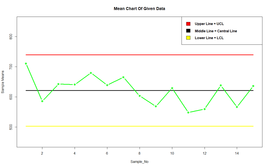
| 502.8462 | 621.2778 | 739.7094 |
Range and its control limits-
View(data.frame(LCL_Range,CENTRAL_LINE_RANGE,UCL_Range))
| LCL_Range | CENTRAL_LINE_RANGE | UCL_Range |
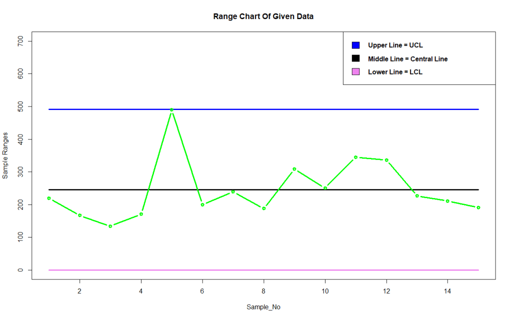
| 0 | 245.2 | 491.3808 |
Output Control Chart for Mean-
#Plotting The Process Control Graph For Mean Of Given Data
plot(Sample_No,rep(CENTRAL_LINE,No_of_Samp),type="l",ylim=c(450,850),col="black",lwd=3,ylab="Sample Means",main="Mean Chart Of Given Data")
lines(rep(UCL,No_of_Samp),type="l",col="red",lwd=3)
lines(rep(LCL,No_of_Samp),type="l",col="yellow",lwd=3)
lines(SampMean,type="b",col="green",lwd=3)

#Drawing The Legend
legend("topright",legend=c(expression(bold("Upper Line = UCL")),expression(bold("Middle Line = Central Line")),expression(bold("Lower Line = LCL"))),fill=c("red","black","yellow"))
Conclusion-
From above mean chart we observe that the process is in well control as far as mean lifespan of the bulbs are concerned as all the points lies well within control limits.
Output Control Chart for Range-
#Plotting The Process Control Graph For Range Of Given Data
plot(Sample_No,rep(CENTRAL_LINE_RANGE,No_of_Samp),type="l",ylim=c(0,700),col="black",lwd=3,ylab="Sample Ranges",main="Range Chart Of Given Data")
lines(rep(UCL_Range,No_of_Samp),type="l",col="blue",lwd=3)
lines(rep(LCL_Range,No_of_Samp),type="l",col="violet",lwd=3)
lines(SampRange,type="b",col="green",lwd=3)

#Drawing The Legend
legend("topright",legend=c(expression(bold("Upper Line = UCL")),expression(bold("Middle Line = Central Line")),expression(bold("Lower Line = LCL"))),fill=c("blue","black","violet"))
Conclusion-
From above range chart we observe that the process is well control except a disruption is observed in 5th sample as the point is lying very far from central line distinct from all other points.
